Analytics
Deep Analytics
Go beyond the headline numbers. Four live Chart.js visualisations — engagement distribution, giving by fund, member growth, and giving methods — turn raw data into strategic insight for your leadership team.
Go beyond the headline numbers. Four live Chart.js visualisations — engagement distribution, giving by fund, member growth, and giving methods — turn raw data into strategic insight for your leadership team.
Built for churches of every size. Free forever. Deployed on your own hosting so your congregation's data never leaves your control.
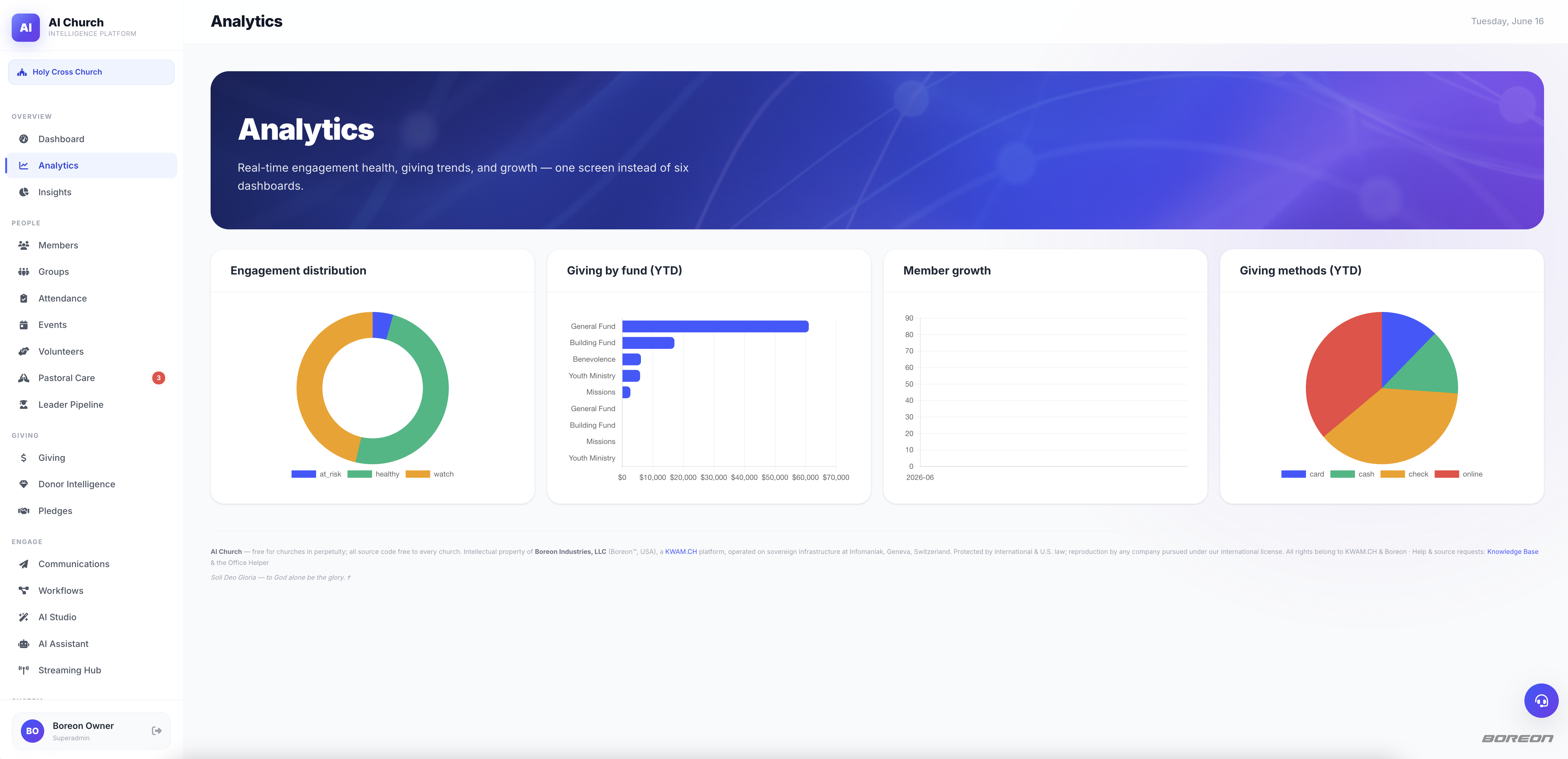
Doughnut chart breaks your congregation into Healthy, Watch, and At-Risk tiers instantly. Know the health of your body at a glance.
Bar chart shows exactly which funds are thriving and which need stewardship attention — General, Building, Missions, and more.
Line chart plots membership over time. Track the fruit of your outreach and identify inflection points that shaped your congregation.
Understand how your congregation gives — cash, check, online, ACH — so your Finance team can optimize collection and reporting.
Beautiful, clear analytics built for pastors and finance teams — no data science degree required.